Color theory in landscape design

Color theory is both an incredibly simple and an undeniably complex concept. In the most basic sense, it is the art and science of using color.
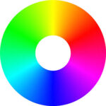
The three fundamental tenets are the color wheel, color harmony, and color context. Using these tenets you can create a vibrant and well-balanced landscape that influences the mindset of the viewer. Read on for some examples.

The color wheel
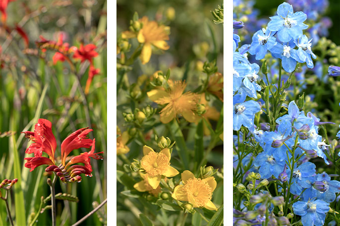
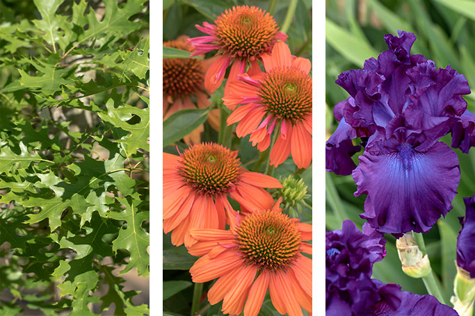
Let's begin with the color wheel. You have your primary colors of red, yellow, and blue. Each primary color has many representatives in the landscape whether it’s the electrifying red of a Crocosmia 'Lucifer', the sunny yellow of Hypericum, or the cool blue of Delphinum, blue spruce, or the exotic Meconopsis. Next up you have your secondary colors: green, orange and purple. Obviously there’s no shortage of green in the landscape, from the uniform green of an oak tree, to the variegated green of the Hosta 'Guacamole'. Orange is slightly more difficult to find. Butterfly Weed, Echinacea, and Daylily come to mind. Don't overlook plants that bear bright orange berries, such as Little Goblin® Orange Winterberry Holly. Purple is an easy find, from flowers like Iris, Phlox, and Campanula or foliage of Cotinus, Weigela, Heuchera, and Ninebark. So many options.

Color harmony
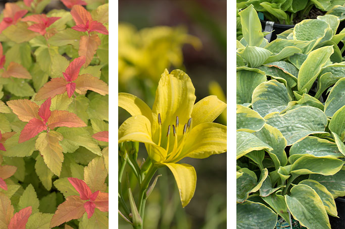
Color harmony can be a difficult thing to achieve. In essence it engages the viewer and creates an inner sense of order. Basing your color scheme on complimentary color pairs such as red/green, yellow/purple, or blue/orange creates contrast and stability. Or you might choose analogous colors, meaning colors that are side by side on the color wheel. Typically with an analogous color scheme, one color will dominate, one color will support, and one color will accent. So combining say, a bright DoublePlay® Candy Corn® Spirea (yellow-orange), Hyperion Daylilies (yellow), and 'Frances Williams' Hosta (yellow-green) creates a wonderful gradient that works well together. Use a primary color to draw the eye to a focal point and two tertiary colors to add dimension.

Another option is using triadic colors, where the colors are spaced equally around the color wheel, for example: 'Ruby Spice' Clethra (pink), Vinca (periwinkle), and Aruncus (cream). Triadic color schemes make each individual item stand out yet still feel balanced.

Color context
Using color to create context in the landscape is relatively simple when you know what each color reflects. Warm colors (colors created using red and yellow) reflect happiness and energy. The color red itself has been show to raise blood pressure and respiration in humans and can have an overwhelming effect if used improperly. Yellow conveys a sense of happiness and permanence. Cool colors typically convey relaxation and calm. Green is a very stable color and can add harmony to most color schemes. Shades of blue can vary greatly from calming to strong and reliable. Purple is associated with creativity and imagination in most of the world, and is also widely recognized as the color of royalty.

There are a number of websites that offer interactive color "calculators" that can help visualize the success of a planned color scheme, or inspire a new one, here are two:
